The desire to create something engaging and eye-catching for social media posts can bring about a conflict between design and accessibility.
Colours
Busy, vibrant images and posters can be distracting (or even distressing) for some neurodivergent students whilst having colours that are too toned down, can make processing hard for those with visual impairments. In order to find the “middle ground”, the most accessible colours, you can look on Sussex University’s webpage that offers an online accessible colour palette finder.
or if you already have chosen colours, check them in this contrast checker on Webaim's website.
Videos
Flashing images, like vibrant colours, can cause a sensory overload for neurodivergent people and can make processing difficult. Flashing lights can also cause seizures in some people which is why we often see a warning message before images with flashing lights are shown. It is best to avoid using such images and effects all together.
It is also important that you make your videos accessible for people who are deaf and hard of hearing. You can use captions for this. Captions in videos describe all audio in the video (simultaneously with the audio) for someone who can’t hear or because of background noise, speaker differentiation, and any other reason that prevents full participation.
Transcripts are a way to convey the message of the video in a written form for people who may not want to or can’t watch your video. It converts spoken content into written, plain text and it should be available as a separate document without having to watch the video.
Subtitles assume the viewer can hear the audio, but they may not speak the language in the video.
Emojis and hashtags
When creating texts, be mindful of emojis and hashtags. Someone with a screen reader will have the emoji’s short name read out. If you only rely on the visual appearance of the emoji you might miss the actual name and the meaning of your text will be altered. Always check the actual name of the emoji to avoid misunderstanding.
Also, do not overuse them. They are read out as many times as they appear in the text.
Hashtags are useful to label your post as belonging to a specific topic for searches and algorithms, but they often have little relevance to the reader. Make sure to put them at the end of your message and don’t overuse them. This will also help your message look less cramped for those who see it.
Capitalising the first letters of each word in the hashtag will make it more likely for screen readers to read the hashtag as intended and it will also help those who have issues with seeing the words as separate entities.
Alt-texts and / or image descriptions
An alt-text contains the key details of an image as a hidden written text attached to the image. An image description is similar, but it is meant to give a more detailed description. However, the two terms are often used interchangeably.
When someone using a screen reader comes across the image, the software will read out the text that was saved for the image. Alt-text is meant to convey the ‘why’ of the image as it relates to the content of a document or webpage. It is important to make sure that you add to the person’s understanding rather than confuse them. Describe the information, not the picture. For example, if it’s a logo of Twitter don’t say it’s a blue bird.
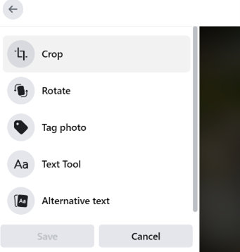
You can add alt-text to Facebook posts by clicking on the ‘Edit’ button and selecting ‘Alternative text’ at the bottom:

Avoid posting images of texts. All important information should be contained in the description of the post.
Find out more about how to write a good alt-text in this guide.